

best colors for app design
How to pick colors for your app without a struggle
The key to picking the right colors for your app is to first understand the basics. You can then go on to apply to any UI that you're designing for. It's very easy to overdo or pick the wrong colors, which is why you may find yourself spending more time than you anticipated simply figuring out what the color of buttons in your product should be, for example. Understanding the basics is the first step to knowing what to do and also knowing what not to do, which is equally important when picking colors.
UI Hierarchy
The co l ors must ensure a clear visual Hierarchy of UI elements. The user should be able to tell which elements of your UI are interactive and how they relate to the other elements on the screen.
Content Legibility
Text and icons should be legible relative to the background they are placed on. Ensure that white text is not placed on a light background and vice versa, for example.
Brand Color
Strategically use the color you have picked for your brand to reinforce your brand visually without overdoing it.
Primary Color
The primary color tends to be the most displayed color in your app's UI elements. It can also be used to accent certain UI elements. Using dark and light variants of your primary color can create a contrast between the UI elements. These variations can be used situationally to distinguish UI elements such as a floating action button and the icon inside it.
Secondary Color
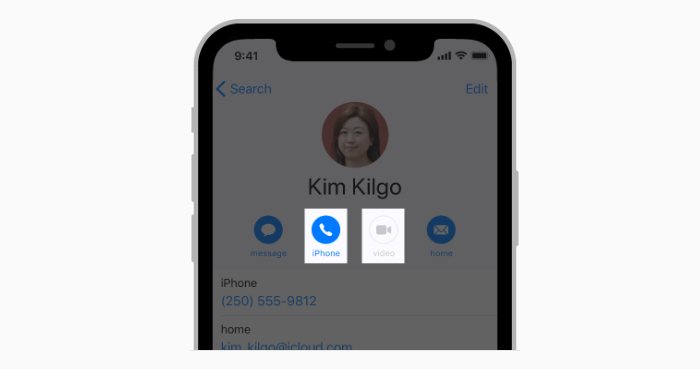
A secondary color can be an alternative accent color and should be applied sparingly to select parts of your UI. This color is best for floating action buttons, selection controls such as sliders and switches, for highlighting selected text, progress bards and for links and headlines.
Surface and Background
Surface refers to a card, action sheet and menu components that are placed on top of the background. The background and error state colors don't typically represent the brand. The background color is usually white or very light gray for a light theme.

Communicate with Color
Use color to call attention to important information, but do this sparingly. For example, a red icon that warns users of a critical problem becomes less effective if red is used elsewhere in the app for non-critical situations.

Interactive vs Non-Interactive
Do not use the same color for interactive and non-interactive UI elements. Using the same color for different things can confuse users and make your app extremely non-intuitive.
Artwork and Color Opacity
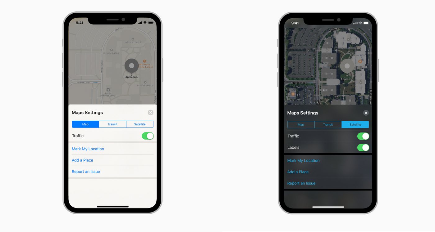
Plan ahead for the kind of colors your content may display if you know the text in white color may become hard to read if a white or light colored artwork may load behind it insert an overlay or a semi-transparent color gradient. The apple maps app, for example, displays a light color theme when in map mode but switches to a dark theme when in satellite mode.
Countries and Cultures
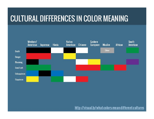
Do some research about the meaning associated with the color you picked in your target country/countries. In some cultures, for example, red means danger. In others, red has a youthful and more positive connotation. Make sure you are sending the desired message with the Primary brand color you have picked for your app.
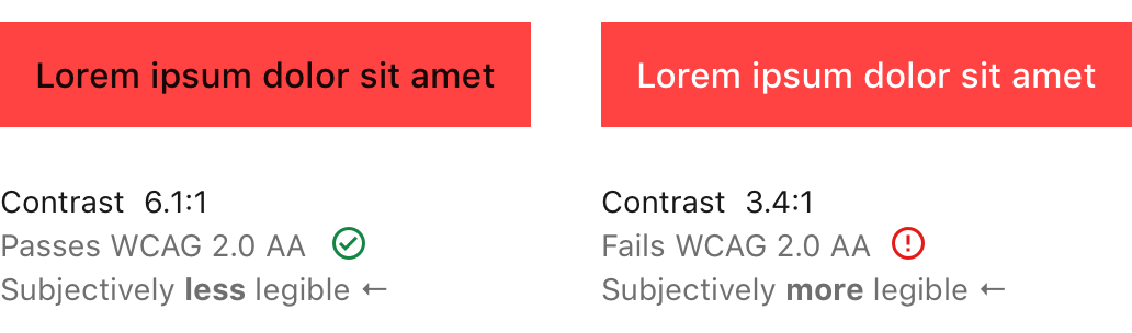
Contrast Ratio
You can make sure the content of your app is easily readable by making sure the color contrast ratio is within a proper range. The optimal contrast range is a minimum of 4.5:1. The ideal ratio is 7:1 however as it meets most accessibility standards. You can use online tools like this.
Color Resources
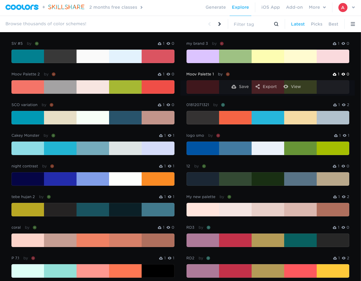
Coolors.co
This site helps you generate a color scheme. You can select one color and the site will show you options that work well with that color, you can keep browsing these generated options until you find a match. There is also an iOS app available.
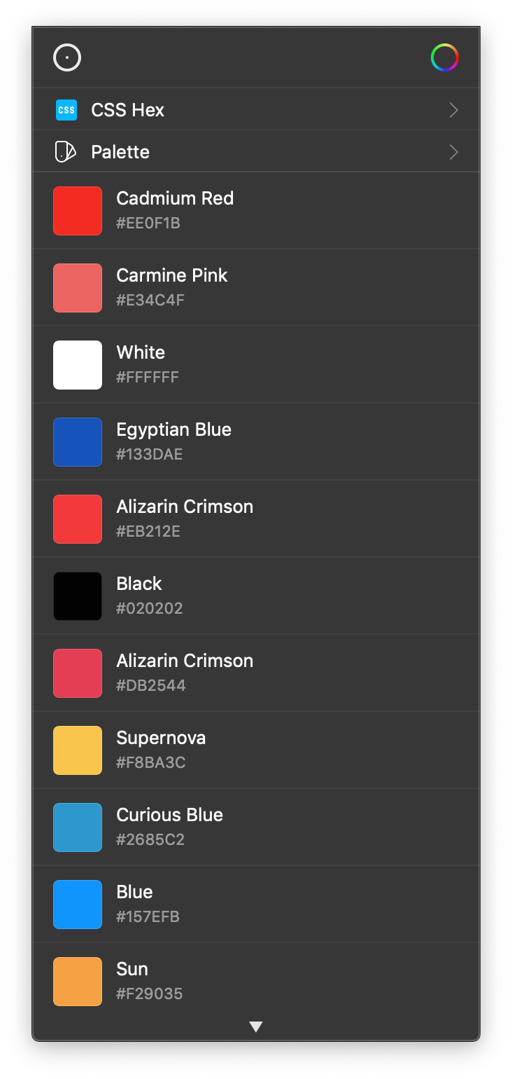
Sip Color
Sip color has a macOS and iOS app that lets you pick colors from anywhere on your screen and create palettes that you can save to access at a later time. This tool is my number one go-to for all my color work. The app lets you get color properties in various different formats including, hexcode, HSB, RGB and many others.
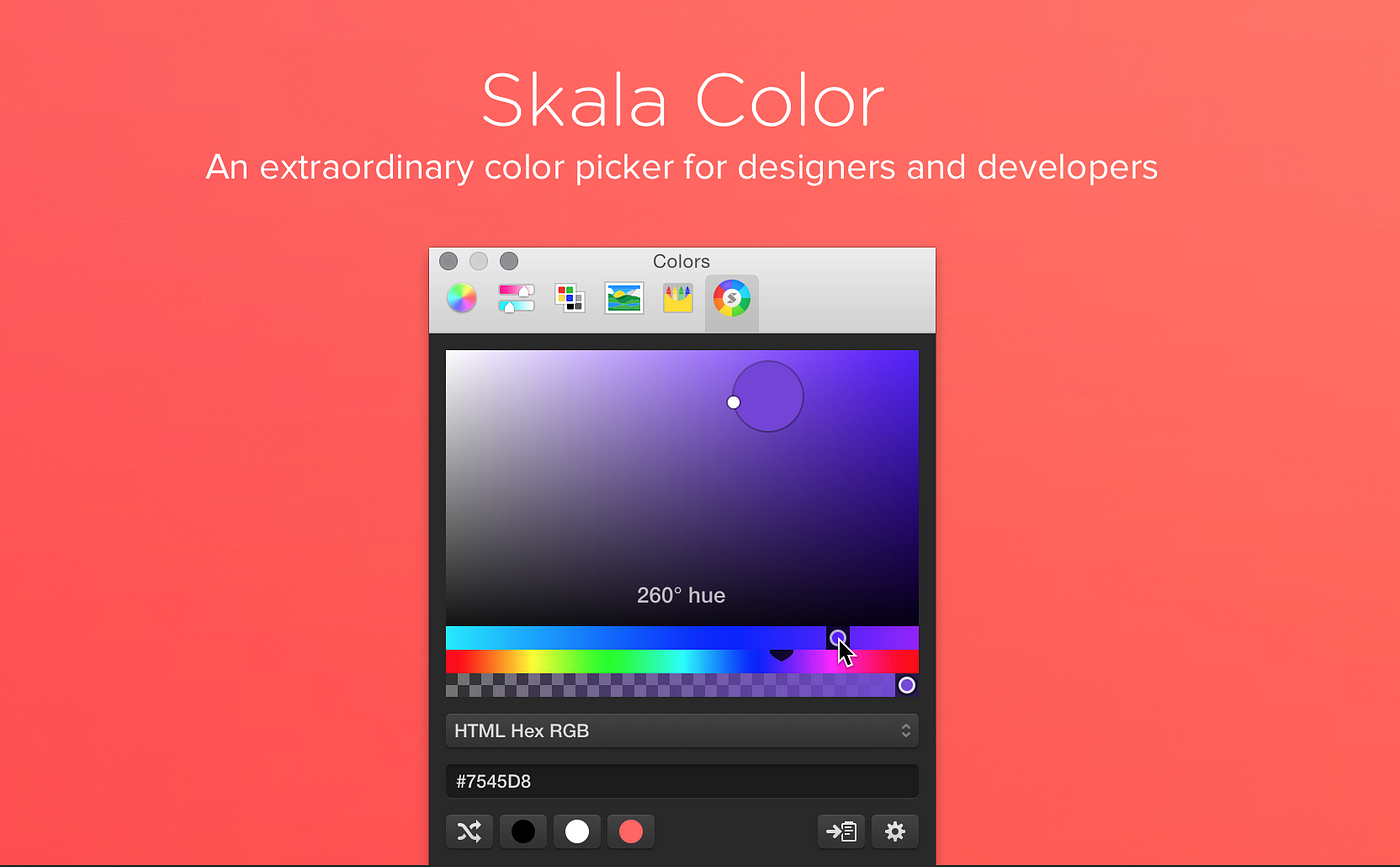
Skala Color
Another macOS app that supports Swift color property extraction and traditional hex-code support.
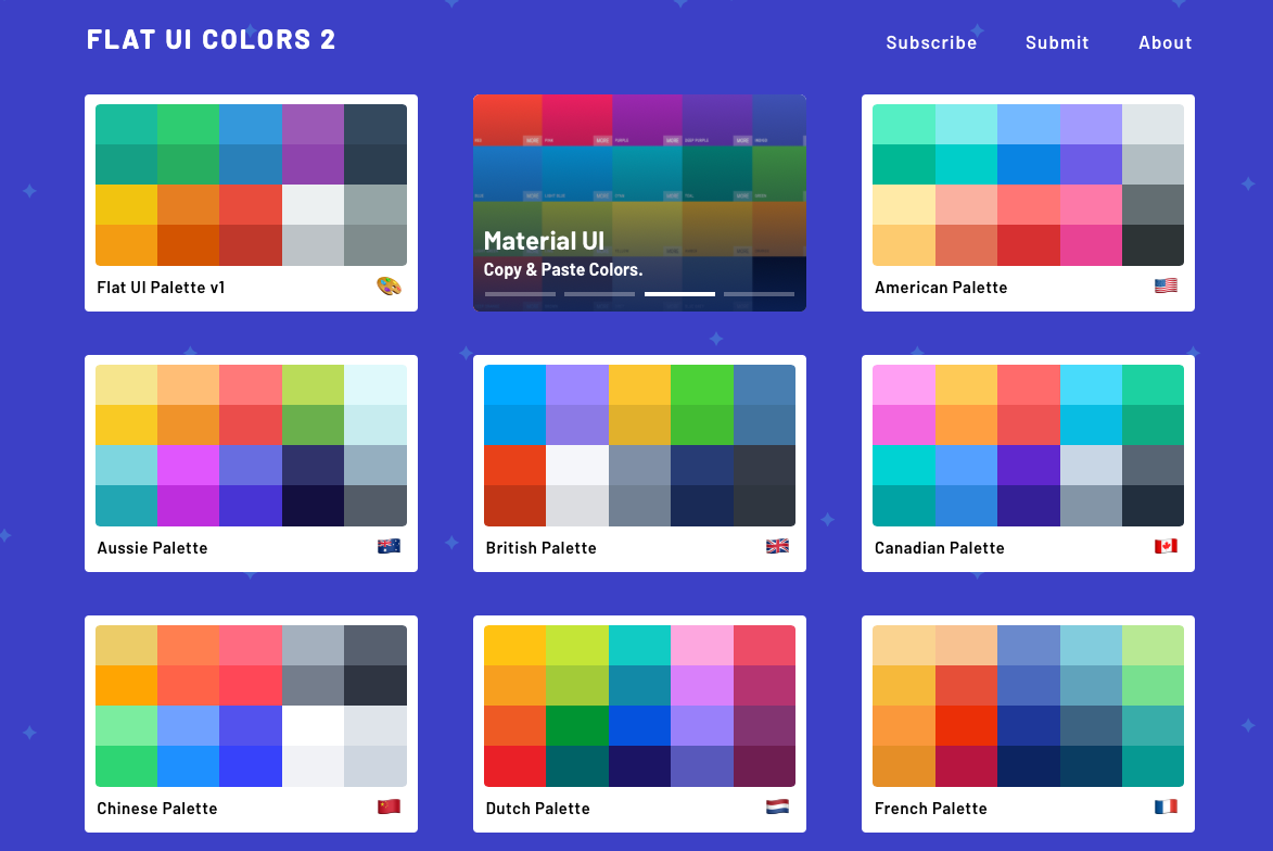
FlatUIColors
This is a great collection of flat color palettes that continues to grow with submissions from users across the globe.
best colors for app design
Source: https://uxdesign.cc/how-to-pick-colors-for-your-app-without-a-struggle-bc46c5e19574
Posted by: clevengerheaden.blogspot.com
0 Response to "best colors for app design"
Post a Comment